


Imagine a television series that dives into the glamorous but complicated world of advertising agencies in 1960s New York. This series, whose name has become a pop culture reference, focuses on the professional and personal lives of these advertisers, especially highlighting the figure of Don Draper, a man with a special talent for marketing and a rather turbulent personal life.
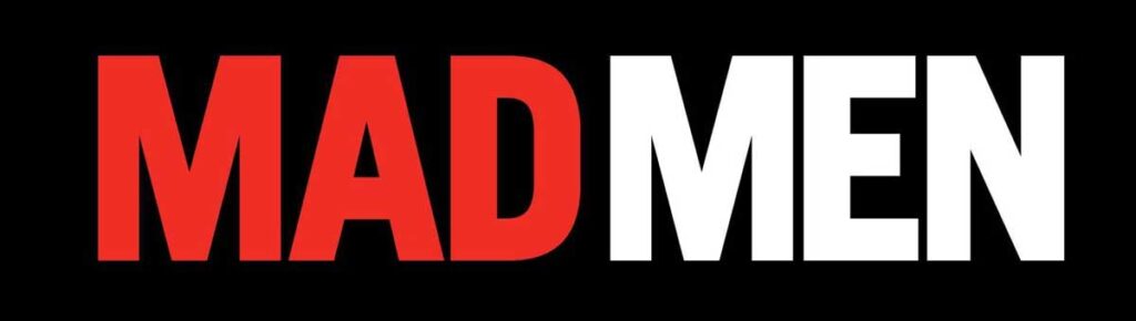
Now, let’s talk about the typography of this series, which is none other than “Mad Men“. The typographic choice for its title is absolutely iconic and perfectly reflects the essence and the time period in which the series is set. They use a font called “Neue Helvetica“
The choice of Neue Helvetica for “Mad Men” is indeed a deeply meaningful and very well thought-out decision. Designed in 1983 as a revision of the classic 1957 Helvetica, this typeface represents a bridge between past and present, between tradition and modernity. In the series, which is set in an era of change and transformation, Neue Helvetica speaks to the constant evolution of design and culture.
The use of Neue Helvetica in the series is more than an aesthetic choice; it is a statement of principle. It represents the sophistication, cleanliness and efficiency of the modern era. Its legibility and clarity reflect the professionalism and precision that characterize the advertising world, while its simple, unadorned design aligns perfectly with the minimalist aesthetic of the 1960s.
In the opening sequence of the series, where the name “Mad Men” appears large, Neue Helvetica is used to create an immediate visual impact. The typeface, in its simplicity, captures the essence of an era when design was beginning to adopt a more minimalist, functionality-focused approach.
The choice of Neue Helvetica also reflects a crucial aspect of graphic design at the time: a leaning toward the geometric, the clean and the functional. This font, with its neutral and objective appearance, does not distract, but rather complements and reinforces the intended message. In “Mad Men,” this translates into a focus on the story and characters, with the typeface acting as a subtle but powerful background.
Don't miss our ultimate guide on graphic design!
Discover the best online courses, master's degrees, and university programs for a successful career in design with our "Ultimate Guide to Studying Graphic Design: The Best Options for a Successful Career". Shape your future in the creative industry today.View Post Read Later
The use of Neue Helvetica in “Mad Men” is not only a tribute to the era it represents, but also a reminder of how graphic design and typography are essential in visual storytelling. The series uses this typeface not only as a design element, but as a narrative tool that helps set the tone and mood.
Can you download the Mad Men typeface for free?
Neue Helvetica is a paid typeface, so in order to use it, you will have to pay a license fee. But there are free alternatives that you can use for your personal and commercial projects such as “Barlow Semi Condensed“, which you can find for free on Google Fonts and which has similar aesthetics and features to the Mad Men typeface.
Take a look at our collection of series typefaces where we compiled the most popular series typefaces.